It is a human tendency to grasp information with better understanding when visually represented. Let’s quote this with an example of a bar or a pie chart representation of data in comparison with monotonous and clumsy spreadsheets on the other hand, which one will you choose?
Well, if you like to follow an interesting approach, your selection must be a visual tool rather than the same old boring spreadsheets and Excel.
Data visualization is a blend of science and art that involves the transformation of complex facts and unprocessed numbers into visually appealing representations that are simple to understand. Effective data visualization can make intricate datasets more accessible, understandable, and actionable.
Data visualization uses a variety of methods, such as treemaps and bar graphs to convey complex information. In any data-driven business, data visualization isn’t just a trend; it’s a necessity.
It gives people and organizations the ability to gain understanding, make wise decisions, and eventually advance.
Data visualization is an important facet of narrowing down hidden layers and patterns in the data. Data visualization charts such as line charts, bar charts, maps, and scatter plots work wonders to process information for you to comprehend without any complexities.
The following are some of the benefits that come with using data visualization tools:
- Real-time Monitoring: Businesses can now keep an eye on their operations in real-time, thanks to the rise of interactive dashboards. This can be useful for tasks such as monitoring supply chains and evaluating sales performance.
- Enhances Storytelling: Data visualization enables firms to tell more compelling tales. This is especially helpful for motivating teams, gaining stakeholders, and drawing in clients. Visual data stories are interesting, captivating, and simple to understand.
- Increases Productivity: Teams can take quick action when presented with graphical data, as opposed to waiting around for unclear or misinterpreted information. This can significantly increase a company’s productivity.
- Risk Management: Organizations that deal with complicated scenarios involving risks and uncertainties can benefit from data visualization. The data’s visual simplicity can help identify possible risk areas.
In this post, we’ve handpicked the best data visualization software, highlighting their outstanding features so that you can get the most out of them.
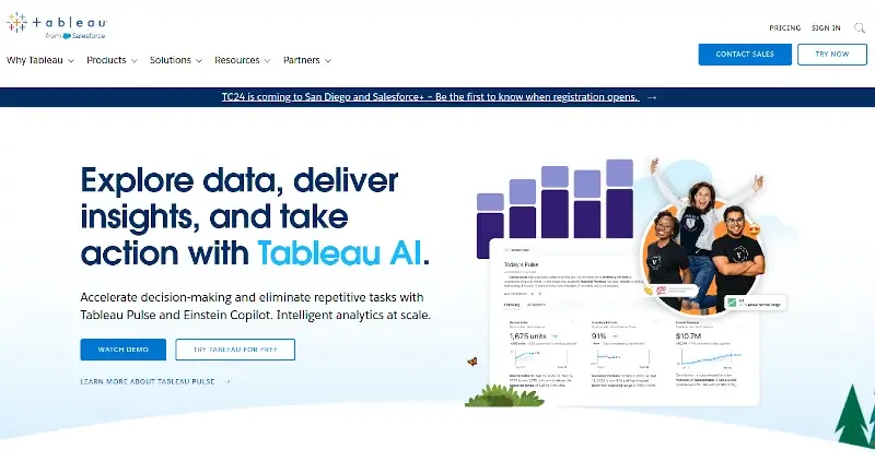
1. Tableau
Tableau is our first choice, which can be widely implemented by scientists, analysts, statisticians, corporate professionals, etc for clean data visualization. This easy-to-use tool gives output in a short time while providing adequate security to mitigate any concerns.
Tableau, allows you to analyze data visually without any limits, create dashboards, and do quick analyses with just a few clicks, and even share your findings with anyone and make a positive impact on your business.
The tool allows its users to clean, prepare, and format the data followed by creating visual content to achieve doable insights to be shared with others.
Whether you work in a big company, a new startup, or a small business, people all around the world use Tableau to look at their data and understand it better
This tool comes for individuals and business teams or organizations with a full version trial with no credit card required.
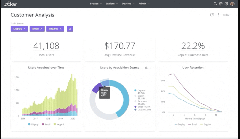
2. Looker
Looker is an in-depth data analytical tool that provides comprehensive insights. It uses a real-time dashboard for data analysis to let you make timely and correct business decisions on the basis of data visualization.
This tool is linked with Snowflake, Redshift, and BigQuery along with over 50 SQL dialects so that you can network with several databases without any issues.
Besides, it can be shared with anyone and lets you export files in any format. To know about its price, you need to submit a request form.
3. Zoho Analytics
Zoho Analytics is yet another business intelligence and analytics tool that lets you generate data visualizations in just a few minutes. With Zoho, access data from various sources and combine it to create multidirectional data visuals.
This tool has a smart assistant called Zia, created using AI or artificial intelligence, natural language processing, and machine learning, you can access Zia in case of any queries.
Zoho lets you publish and share reports with your peers and add comments or initiate conversations. Besides, Zoho Analytics files can be exported in any format like Excel, PDF, Spreadsheet, Word, etc. Zoho comes with a basic plan at $11.55/month billed annually.
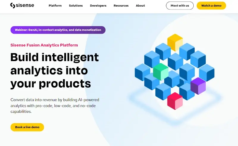
4. Sisense
Sisense, a data visualization tool is based on a business intelligence model to offer multiple tools for data analysis while simplifying complex data to gather insights.
It follows a data-driven approach thus providing top-notch data analytics tools for business. The tool is pretty easy to set up and use, it can be installed in minutes and provides instant outcomes.
It additionally allows the users to export files in distinct formats like PDF, Word, Excel, PPT, etc, while offering full-time customer support, in case of users witness any issues. You can check out its prices by submitting a form.
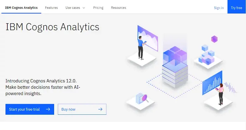
5. IBM Cognos Analytics
IBM Cognos Analytics is based on an artificial intelligence platform to support data analytics. It lets you visualize and then analyze the data to provide actionable insights.
IBM Cognos Analytics tool is pretty simple to use; even if you don’t have data analytics knowledge, you can easily comprehend the data with it in a simple language. It lets you share data with others on the cloud using emails or Slack.
Besides, you can also import data from multiple sources such as CSV, spreadsheets, cloud, etc. to combine relatable data sources into a single one. This tool offers a 30-day free trial and its monthly plan starts at $10.60 Per User/Month.
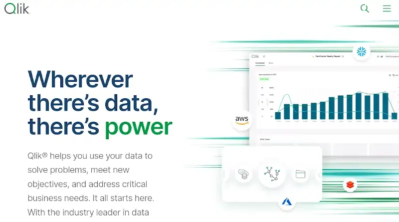
6. Qlik Sense
Qlik Sense a data visualization tool that provides associate data engines with an artificial intelligence system and multi-cloud architecture to help companies to turn into data-driven enterprises by deploying a combination of Saas on a private or on-premises cloud.
This tool lets you seamlessly load, combine, visualize, and explore the data, irrespective of its size. All its visualizations, charts, and tables get immediately updated as per the present data context.
This tool offers data insights to help you generate analytics with drag-and-drop functionality. Its price starts from $20 per user/month 10 user minimum, billed annually.
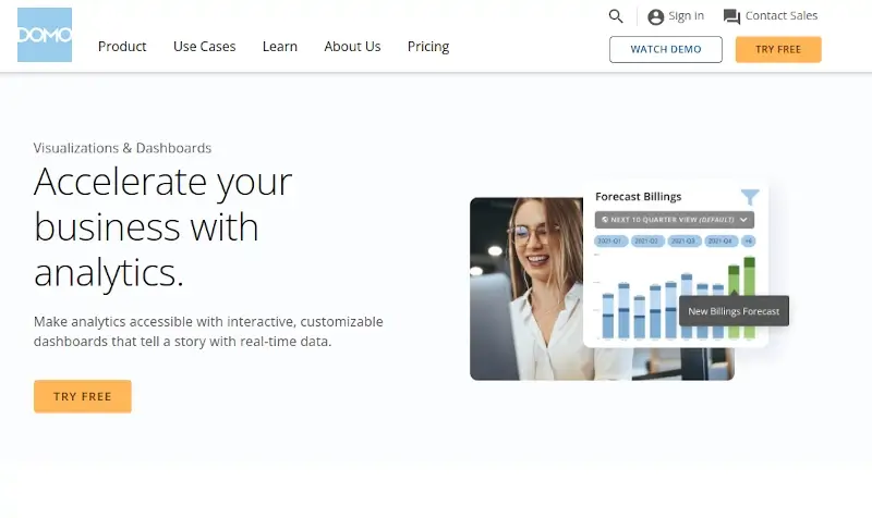
7. Domo
Domo comes with many data visualization tools to offer you an interactive platform to conduct data analysis and create impressive visuals for others to easily understand your motive.
It lets you collaborate images, cards, and texts in the dashboard so that you can flawlessly guide others. You can make use of its in-built dashboard to get timely insights using the data. This tool has a free trial option for you to try and make further decisions based on its functionalities.
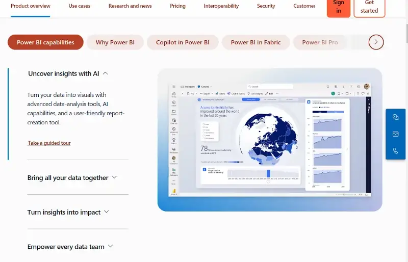
8. Microsoft Power BI
If you are looking for a solution to create a data-driven business intelligence then Microsoft Power BI is the best tool! It offers self-service analytics to analyze, share, and aggregate data in a meaningful way.
This tool features hundreds of visuals including in-build artificial intelligence abilities and Excel integration.
This pocket-friendly tool comes at $9.99 per month for a single user and offers multiple support systems like forums, live chat, faqs, etc.
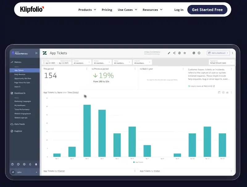
9. Klipfolio
Klipfolio is a Canadian company dealing with Artificial Intelligence to offers the finest data visualization tools. It allows you to access data from multiple data sources such as files, web services, spreadsheets, databases, etc. using connectors.
It also lets you create drag-and-drop visuals while letting you select options such as graphs, charts, scatter plots, etc.
Klipfolio lets you use tools to implement complicated formulas to solve data problems and challenges. It has a 14-day trial version and its standard plan comes at $250 on a monthly basis.
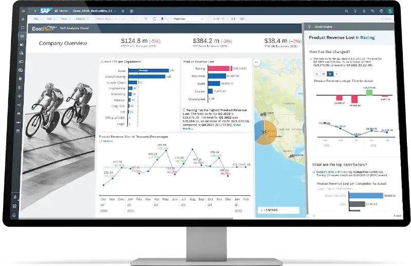
10. SAP Analytics Cloud
The SAP Analytics Cloud is based on business intelligence and data analytics to let you analyze your data and create visuals. This tool features advanced modeling tools that notify you of errors in the data while classifying multiple data dimensions and measures.
This SAP Analytics Cloud offers smart transformations for better visuals. It offers complete customer satisfaction by handling customer-generated queries with artificial intelligence and language technology.
SAP Analytics Cloud for business intelligence, and predictive analytics, standard edition costs you around USD432.00.
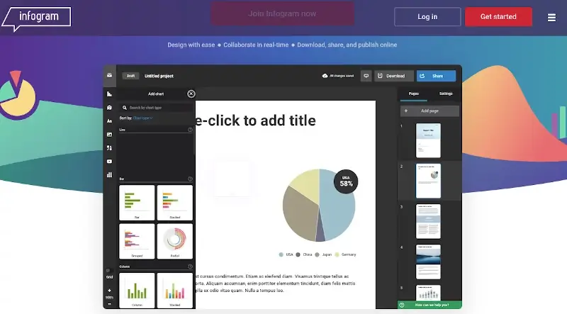
11. Infogram
With Infogram, you can easily create and share stunning reports, maps, infographics, and more. You can pick from pre-made layouts, add interactivity, personalize your brand, and use statistics and metrics to gauge your success.
In addition, you can publish your work online or download it while working in real-time collaboration with your team. Many journalists, marketers, academics, and companies utilize Infogram to visually represent their data and stories.
12. QlikView
QlikView is a guided analytics tool that lets users use an associative engine to explore and analyze data from any source. With QlikView, you can ask questions, collaborate with your team, and create interactive dashboards and applications.
Qlik is a software company that focuses on data analytics and business intelligence, one of its products is QlikView. QlikView is designed for users who want to quickly construct and deliver analytics solutions with minimal coding.

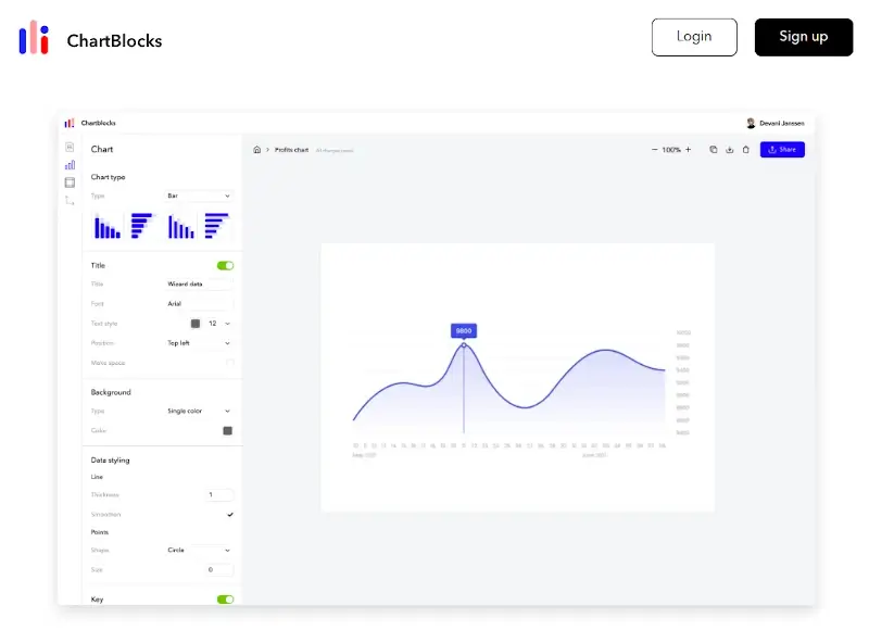
13. ChartBlocks
ChartBlocks is a data visualization tool that lets users easily create and share custom charts. It features metrics such as views, clicks, and shares, which you can use to monitor how well your charts are performing. You can integrate your charts with Google Analytics to get more insights.
In addition, ChartBlocks allows you to make your own unique templates or select from pre-made ones. You have the option to share or store your templates for later use. You can also manually enter your data or import it from a variety of sources, including databases, CSV files, JSON files, spreadsheets, and more.
14. DataWrapper
Datawrapper is an all-in-one tool that lets users build visually appealing, interactive data visualizations such as tables, charts, and maps without having any coding experience.
With Datawrapper, you can collaborate with your team to edit and discuss your data visualizations. You can also manage your files and projects with ease.
News outlets, academic institutions, governments, and other organizations frequently use Datawrapper to produce publish-ready visualizations across a range of platforms, including the web, mobile applications, and print.
15. D3
D3 is a free open-source JavaScript library that you can use to create bespoke data visualizations. You can use D3 to change the document object model (DOM) based on data, as well as add numerous graphical and interactive features to your web pages.
D3 is extensively used by web developers, data analysts, journalists, and researchers to produce charts, maps, graphs, and other data-driven applications.
16. Jupyter
Jupyter is an interactive development environment for code, data, and notebooks. It allows users to create and organize workflows in data science, scientific computing, and machine learning thanks to its flexible interface.
With Jupyter notebooks, you can create and share documents with live code, equations, visualizations, and narrative text in an interactive environment. Notebooks are arranged into cells with various types of information, including code and Markdown text.
More than 40 programming languages including Python, R, and Julia, are all supported by Jupyter. Besides that, it allows you to produce rich interactive output in the form of HTML, pictures, videos, LaTeX, and unique MIME types.
17. Plotly
Plotly is a platform for developing and deploying data apps in Python with Dash Enterprise (a low-code solution for data science apps). Plotly provides a graphing library for Python known as Plotly.py, which you can use to make interactive, publication-quality graphs.
Various chart types, including line, scatter, bar, pie, box, histogram, heatmap, map, and three-dimensional charts, are supported by Plotly. In addition, Plotly allows you to customize, animate, and add interaction to your figures.
Plotly works with additional Python environments such as Google Colab, Jupyter notebooks, and others.

18. FusionCharts
FusionCharts is a platform that lets users design data-driven, interactive maps, and charts for use in mobile and web applications.
FusionCharts provides more than 100+ charts, graphs, gauges, and 2000+ data-driven maps with a consistent API, comprehensive documentation, and responsive support.
With FusionCharts, you can visualize a wide range of data, including financial, geographical, time-series, stock, IoT, and more. All widely used JavaScript frameworks and back-end programming languages are compatible with FusionCharts.
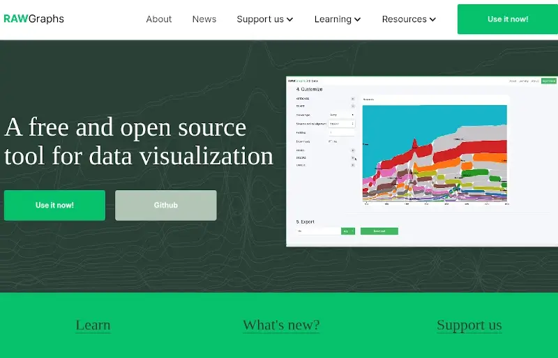
19. RAWGraphs
RAWGraphs is web-based data visualization software developed in the JavaScript language. It uses D3.js to generate editable SVG format visualizations. RAWGraphs allows you to import data from a variety of sources, including Google Sheets, TSV, JSON, and CSV files.
You can then select from almost thirty different visual models to analyze and present your data. In addition, It allows you to add labels, colors, filters, and other customizations to your charts. RAWGraphs is built on top of open-source projects and is open to the community for contributions.
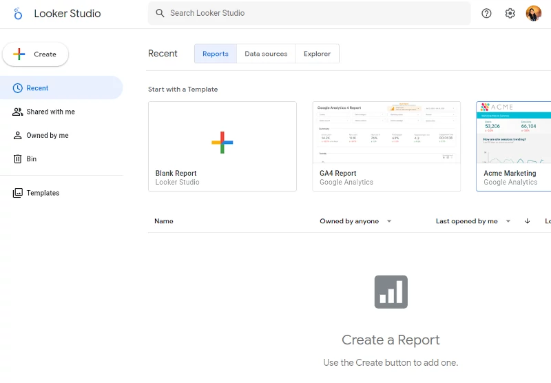
20. Google Data Studio
Google Data Studio is an effective tool for designing stunning, adaptable, interactive, and responsive dashboards. It provides small and large businesses with invaluable resources to support their marketing initiatives.
It also enables users to create reports with graphs, tables, and images and connect to numerous data sources, including BigQuery, Google Sheets, and SQL databases.
In addition, Google Data Studio is a Google Cloud service, which implies that Google Cloud users can benefit from enhanced compliance standards and privacy guarantees.
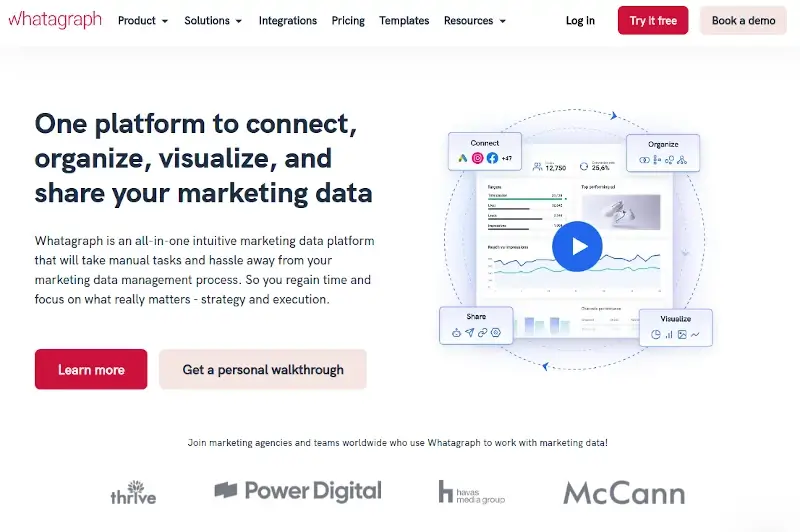
20. Whatagraph
Whatagraph is a platform for data reporting and visualization that enables users to produce visual reports from a variety of data sources. Its main application is in marketing reporting, where it assists companies and marketing experts in presenting performance indicators in a clear, aesthetically pleasing manner.
One of Whatagraph’s features is its integration with several data sources, including LinkedIn, Instagram, Google Analytics, and more. After gathering data from various sources, users can develop customized reports and dashboards that provide them with a thorough understanding of their marketing initiatives.
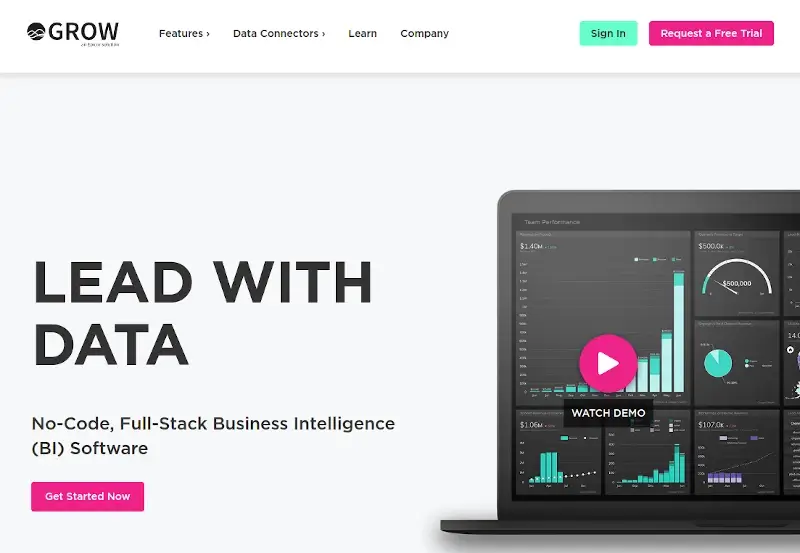
21. Grow
Grow is a full-stack, no-code business intelligence (BI) platform that can combine, integrate, and store data from hundreds of SQL databases and data sources. In addition, Grow provides stunning and interactive dashboards and visualizations that enable users to make data-driven decisions.
It provides a variety of chart types, such as gauge, funnel, area, and column and bar charts, making it easier to see trends and patterns. With the help of filtering, slicing, and drilling features, you can quickly ask questions about your data metrics and interactive dashboards.
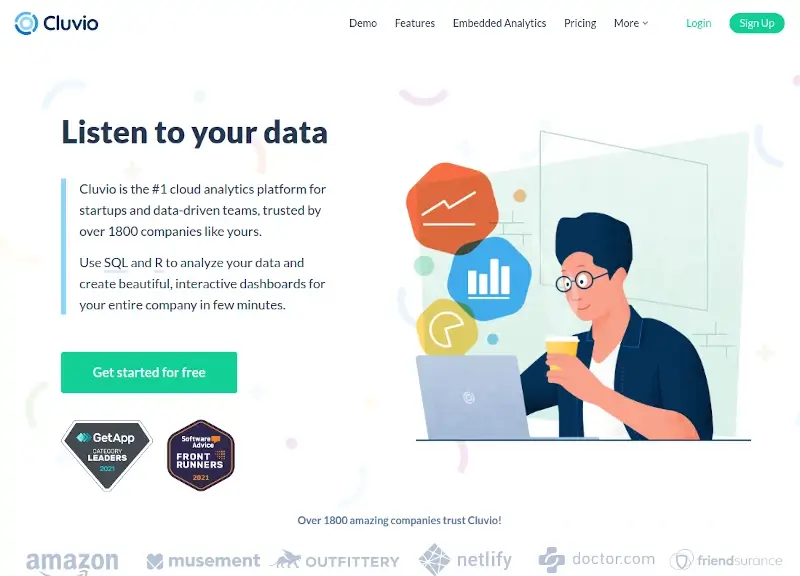
22. Cluvio
Cluvio is an analytics platform trusted by over 1800 companies and startups. It allows users to analyze data using R and SQL and produce interactive dashboards. You can also share your dashboards and reports with your team, connect to any SQL or R database, and receive recommendations and alerts in real-time.
Cluvio supports various SQL databases, including Microsoft SQL Server, Oracle, Google BigQuery, Redshift, Athena, BigQuery, and Snowflake. In addition, it allows users to sign up for a free 14-day trial of the business plan.
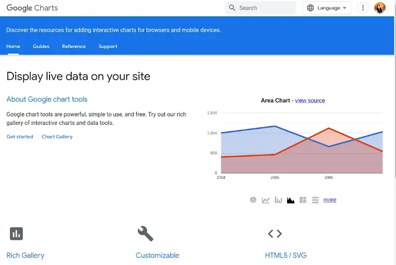
23. Google Charts
With Google Charts, you can easily create and modify interactive charts and data visualizations on your website using JavaScript.
It offers a variety of chart types, including bar, pie, spline, area, line charts, and more. You can also show real-time data on your website by utilizing the code editor, dashboard, chart gallery, and data connection tools.
Google Charts operates on various browsers and devices without the need for additional plugins or software and is compatible with HTML5 and SVG.
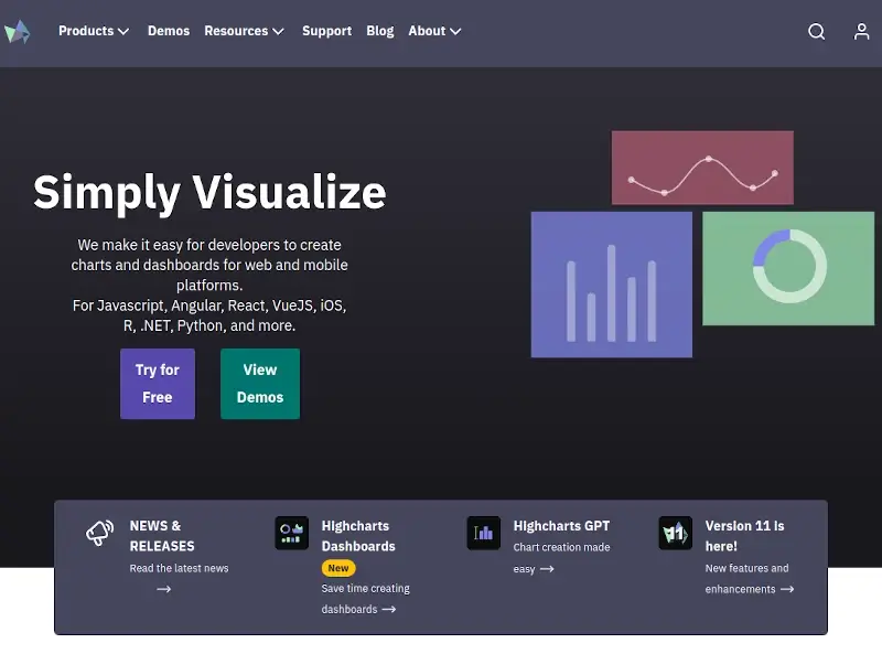
24. Highcharts
Highcharts is a robust JavaScript library that is used to create dynamic, eye-catching graphs and charts for websites. It is extensively utilized for data visualization in web apps. Line charts, bar charts, column charts, pie charts, scatter plots, and more are among the chart designs offered by Highcharts.
The charts are tailored to be responsive, meaning they can adjust to various screen sizes and devices. A wide range of customization options, including colors, labels, tooltips, and more, are available in the library to alter the look of charts.
Highcharts is the most developer-friendly library due to its simplicity of use and adaptability. The examples provided are more than sufficient to get you started, and the documentation is well-organized.
Frequently Asked Questions (FAQ’s)
Here are some of the Frequently Asked Questions (FAQs) about Data Visualization
1. Can these tools handle large datasets?
Indeed, many data visualization tools are tailored to work with large datasets. Large dataset handling varies depending on the particular tool and its features.
2. Are these tools suitable for beginners?
Yes, the user interfaces of data visualization tools are simple to use and intuitive. In addition, there are active user forums for many data visualization tools where beginners can ask questions, exchange experiences, and pick up tips from others.
3. Do I need programming skills to use these tools?
No, most of the widely used data visualization tools available today do not require programming knowledge. These tools provide intuitive interfaces, drag-and-drop capabilities, and pre-made templates, enabling users without any programming experience to visualize data.
4. Are these tools compatible with different data sources?
Indeed, most of the data visualization tools are designed to work with a variety of data sources. One of these tools’ most important features is the ability to connect to and view data from several sources.
5. What distinguishes these tools from traditional reporting software?
Traditional reporting software and data visualization tools stress different methods of presenting information. For instance, charts, graphs, maps, and other visual elements are used in data visualization tools to communicate patterns, trends, and insights.
In traditional reporting software, data is usually presented in rows and columns in tabular reports. These structured reports frequently have text and numerical values in tables.
In addition, Interactive features are a common element of data visualization tools, enabling users to actively explore and interact with the data. To comprehend the information better, users can filter data, delve down into specifics, and work with real-time representations.
Traditional reporting software frequently produces static reports without the dynamic and interactive components seen in data visualizations.
Conclusion
Organizations can gain a competitive edge, spur innovation, and make informed decisions by converting complex data into visual representations. To assist users in efficiently exploring and communicating data, the best data visualization tools offer a variety of capabilities, customization choices, and interactions and are compatible with a variety of data sources.
Listed above are the best-handpicked collection of data visualization tools. We recommend exploring the capabilities and potential of the tool by using the demo or trial version before your final purchase in order to know whether the tool you wish to buy can fulfill your requirements or not.